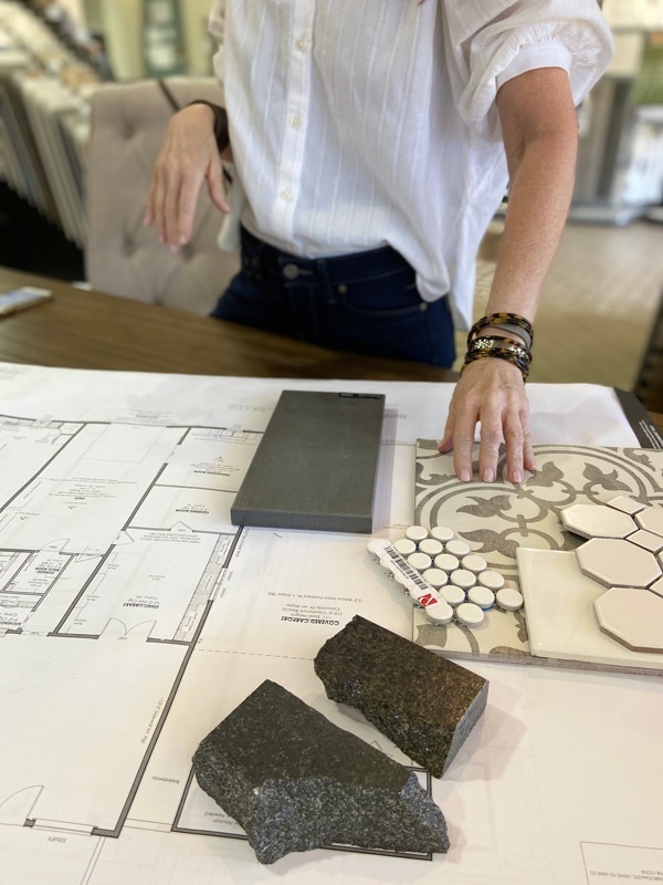
Rock & Vine Magazine asks our HAUS contributor Jennifer Eggleston to walk us through the bewildering assortment of interior choices as it pertains to tile, hardware, flooring and stone. Thematically she navigates us through the bevy of choices that can confound our ability to move forward with confidence when building our own outward expressions in design and theme.

RV: When looking at structure with clients are you focused firstly on floors or tile?
JE: I envision the whole picture, or project, as a concept first. Then, I work or ease into the details. Flooring is so much like wallspace – a backdrop, so to speak, so floors are definitely part of the jumping off point.
RV: When looking at tile or flooring are you looking for cohesiveness or contrast?
JE: BOTH! I would answer primarily cohesive, with room for contrast.
This answer definitely depends on the space/or location.
For example, flooring should be cohesive throughout the majority of the space, to maintain that classic, timeless, cohesive backdrop; but there is room for an area to have some fun. Good examples of placing a contrast, or showcase tile are:
“The obvious powder bath”: Where there is an opportunity to utilize a more dramatic tile that may be more expensive, but used in a smaller area, it can be somewhat cost effective for the effect.
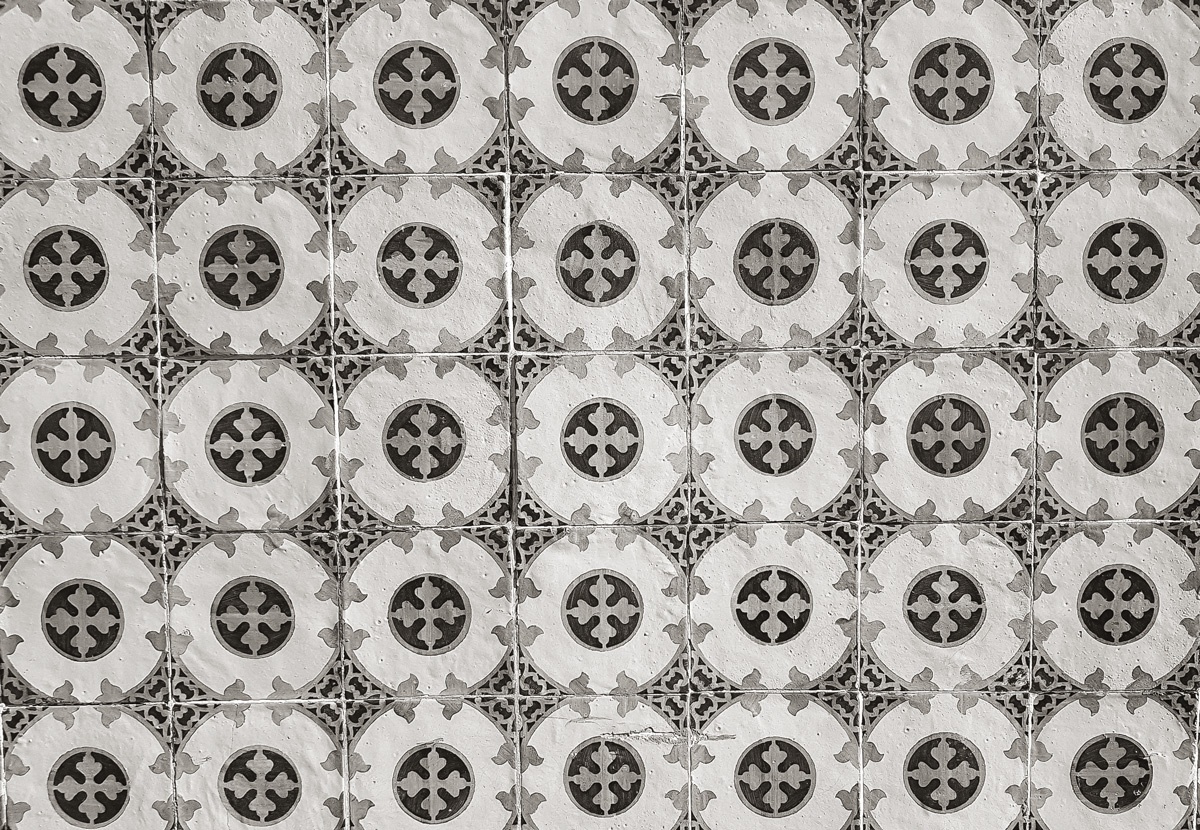
Utility room: So many clients crave fun patterned tiles in their utility room, whether on the floor, or as a backsplash…this is definitely a room for something a little different.
Mudroom: Using a contrast tile on the mudroom floor can give a pop to the usual mudroom, plus help with maintenance.
RV: Tile spans into many themes for design; it can be decorative, it can be bold or a visual continuation within structure that implies substance. What is your preferred statement or vision when working with tile?
JE: First, anyone who knows me knows how much I love tile. So, almost all of the above.
I look at tile as an artistic statement. It’s dimensional. It adds volume, texture, sheen, height, length, structure, impact, I could go on and on.
When I design a space such as a kitchen, or bathroom, I already have a tile image in mind that I want to work around.

I feel that the tile selected should look as though it was made for that space.
I am a huge fan of metallic tile, but mixed with non contemporary surroundings.
I am also a huge fan of mixing a very basic penny round or classic subway, but with a contrast grout to make it current.
RV: Stone, agate, granite, Slate, etc; when looking at Stone as a feature for counters in bathrooms or kitchens what is your preferred material? Are you looking for veins, light, color specs?
JE: I tend to gravitate to very natural light materials, or very dark. No in between.
Marble is gorgeous, but not feasable for everyone.Quartz provides a wonderful material as an option to that offers so many variations on marble.
Soapstone is another material I love; very old school, and classic something that I just recently went back to: absolute black granite, leathered finish. Incredible texture; nice to contrast with whites and grays.
RV: Hardware for cabinetry is an essential and personalized choice that defines in detail your vision for any number of focal points within a home. Where do you like to add whimsy? And where is it cost effective to pick a standard statement in repetitive design?
JE: Hardware selections can be so overwhelming.
If you can splurge, do so in the kitchen, and master bath. These are your impact areas, and add value for resale when it comes to real estate. Try to remain classic; nothing too over the top, and remember, not to small! I tend to use slightly larger cabinet hardware in the kitchen; mainly when the kitchen is open into a great room (think higher ceilings, larger spaces).
The powder bath is a great spot for different cabinet hardware; typically cabinetry is limited so hardware quantity is at a minimum. Basically a lot of look and impact while not acquiring a huge expense.
Mudroom cabinet, great room cabinets, and bar cabinets are great impact areas for “splurge hardware”.
When working on a budget: the laundry room does not need expensive hardware.
Areas where repetition is fine will help keep costs down. Examples are secondary or guest bathrooms This makes it very simple and streamlined. You can actually carry this concept over into plumbing and bath fixtures, as well.


